Uphold’s user onboarding flow
Assigned task: To examine and suggest changes to the existing user onboarding flow’s copy, for both web and mobile.
My role: UX writer
Expected outcome: The user’s account is set up and is successfully onboarded onto Uphold.
Copy categories covered: Headlines, Body copy, Straplines, CTAs, T&Cs, Forms.
My process
My work re improving the onboarding experience led to my collaboration with the concerned Product Manager, Lead Designer, the SVP Enterprise & Operational Risk, and the COO.
For a comprehensive understanding of best practices regarding user onboarding (as I had never worked on one before), I started with an analysis of user onboardings of other apps, fintech in particular.
I organized meetings and gathered insights from the concerned stakeholders regarding how they wanted the users to be received, especially the tone and verbiage. I also sought out the reasoning for the existing copy from the designers.
I gathered insights from the Data team as regards the funnel drop-off rates of the onboarding process, with a focus on screens with the maximum drop-offs.
After synthesizing all the research, I carved out some fundamental guidelines for the copy revision (as set out in the section below).
In addition to copy revisions, I played a role in dictating and revising the flow of the onboarding screens.
Problem statement
Following are the pain points discovered from the research done of the existing onboarding;
The tone of voice is geared towards ‘issuing instructions’ as against making the user feel comfortable and welcomed.
The user expectations are being ill-managed as regards all the actions and tasks they’re required to complete before they can use the app to its full capability.
The flow of information faltered at certain screens. The user was being prematurely shown the welcome message, even though there were still more actions to be performed before the platform is fully functional.
Guidelines for copy revision
Be clear: Needs to be easy to understand.
Be short: Don't give the customer extra work. Remove cluttered language and focus on the benefits.
Be helpful: Be friendly and conversational in tone.
Be humanistic: Use well-timed humor and well-known slang to establish contextual informality with the user and to attribute a more ‘conversational’ approach.
Use simple present tense.
Use active voice.
Use the customer’s voice for CTAs.
Use copy to reinforce trust and establish transparency.
Avoid jargon and use simple, non-technical language.
Consistency is key: When using a specific tone for a certain set of screens, ensure consistency in that tone.
Introductory screens should be used as an opportunity to get the user excited, and if they have concerns about privacy, security, or others, we can always provide links in the following screen.
The Onboarding Flow: Analysis of existing copy and recommendations

Screen 1
Copy analysis
The headline ‘Sign up to Uphold’ sounds impersonal and mechanical.
The CTA ‘continue’ is better used when the context is the same, and the user’s taken from segment to segment in the same context.
Copy suggestion
‘Sign up to Uphold’
Instead:
“Create your Uphold account”CTA: ‘Continue’
Instead:
“Next”

Screen 3
Copy analysis
The tone in which the subheading directs the user to check their email sounds like a condescending instruction.
Copy suggestion
‘Check your email now’
Instead:
‘It’s time to check your email’‘Verify your email by clicking the link we’ve sent to this address. If you need help, please click here.’
Instead:
Iteration 1: ‘We sent a verification link to your email address. Please open your email and click on the link to verify it. If you need any help, we’re here.’
Final iteration: ‘ Please click on the link we sent to your email. If you need any help, we’re here.’

Screen 5
Copy analysis
In the body copy, it’s not immediately clear what ‘mobile data’ implies. It could be mistaken to mean the user’s internet data plan.
The placement as well the copy of the ‘manage data usage’ ghost button seems without context and ambiguous in terms of what the user can expect to see when selecting it.
It’s not clear that by selecting the ‘yes, I'll help improve uphold’ CTA, users bestows a blanket consent on the app to collect their data.
The placement of the ‘Not now’ button should be in the same hierarchy as the two other CTAs, since the user’s focus when deciding what to do with the screen is focused on where the CTAs are positioned. A more optimistic alternative for ‘Not now’ would be ‘Maybe later’.
Copy suggestion
For ‘Opt-in’ countries:
‘Help us improve
We use your mobile data to refine our products and services and give you a better experience. You’ll always be able to manage your data usage.
Learn more about our data usage or review our Privacy Policy for more details.
Instead:
We value your privacy!
To improve and offer you a customized experience, we would like permission to collect your data.
To know what data of yours we’ll collect, check our Data Usage or review our Privacy Policy for more details. You can always control what data we use through the Privacy settings.CTA: ‘Manage data usage’
Instead:
‘Manage what data Uphold uses’CTA: ‘Yes, I’ll help improve Uphold’
Instead:
‘Yes, Uphold can use my data’For ‘Opt-out’ countries:
Help us improve
‘We use your mobile data to refine our products and services and give you a better experience. You can manage your preferences anytime in Settings.
Instead:
We collect and use your data when you use the Uphold wallet to refine our services and provide you with a better user experience. You can always change what data Uphold uses through the Privacy settings later on.

Screen 7
Copy analysis
The purpose of this screen is to get the user to turn on notifications. ‘Let’s stay in touch’ makes it sound like the user is leaving Uphold. It’s ironic, especially with this screen being a part of the onboarding process.
Concluding the description on ‘other useful stuff’ makes the copy sound flimsy and tired.
The two CTA’s are contextually linked, but that’s not clear from neither the copy nor the design of the buttons. The placement of the ‘not now’ button should be in the same hierarchy as the two other CTAs, since the user’s focus when deciding what to do with the screen is focused on the CTAs.
Copy suggestion
Let’s stay in touch!
Instead:
Don’t ever miss out!Receive price alerts, investment research, trading insights, news, and other useful stuff.
Instead:
Receive price alerts, investment research, trading insights, news, and much more by enabling notifications.CTA 2: ‘Yes, I’m in’
Instead:
Yes, keep me notified

Screen 2
Copy analysis
Asking the users to provide their personal information in those very words could be unnerving to read, especially given the general air of mistrust around data collection.
Include a link explaining why Uphold needs the user’s personal information, especially for the phone number. For example;
‘Why does Uphold need my personal information?’ or
‘Why does Uphold need my phone number?’ or
‘Will Uphold send advertisements to my phone number?’Copy suggestion
‘Let’s get your personal information’
Instead:
‘Please provide the following’
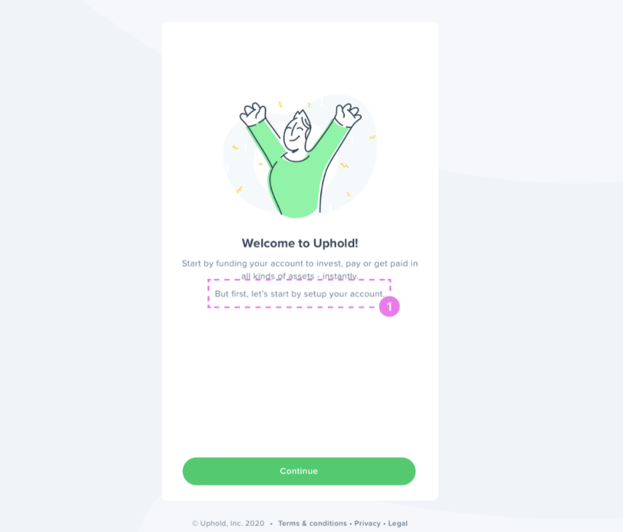
Screen 4
Copy analysis
This should be the last screen the user sees right after which the user should be able to start interacting with the app. All other requests for user consent should already be dealt with, which isn’t the case here.
Instead of a static ‘Welcome to Uphold’ message, this screen’s real estate can alternatively be used to personally welcome the specific user being onboarded to Uphold, i.e. by addressing him/her/they by their first name.
Copy suggestion
‘Welcome to Uphold’
Instead:
Welcome *insert first name*‘Start by funding your account to invest, pay, or get paid in all kinds of assets - instantly.
But first, let’s start by setting up your account.
Instead:
Iteration one: We’re happy to have you! Your account has been successfully set up.
Start Using your account to invest, pay, or for getting paid in all kinds of assets. More than 100 assets are now less than a minute away!
Do all this and much more!
Final iteration: We’re happy to have you! Now that your account is successfully set up, you can invest, pay, or get paid in all kinds of assets. More than 100 assets are now less than a minute away. Do all this and much more!CTA: ‘Continue’
Instead:
‘Let’s do this!’

Screen 6
Copy analysis
The heading ‘Data usage’ is ambiguous.
The description for Analytics’, ‘Product improvements’ and ‘Diagnostics’, each declaring consent on behalf of the user, is confusing and seems incomplete. None of the descriptions explain what the user is consenting for and how the same is being achieved.
Copy suggestion
Heading: Data Usage
Instead:
‘Manage data usage’Analytics
I’m happy for Uphold to better understand the effectiveness of its marketing campaigns.
Instead:
‘I’m happy to help Uphold better understand the effectiveness of its marketing campaigns through the use of data connected to my transactions, payment methods, and more.’Product Improvement
I’m happy to help Uphold give me a great user experience by better understanding what’s important to me
Instead
I’m happy to help Uphold improve my user experience through the use of data acquired from the actions I performed or the screens I viewed.Diagnostics
I’m happy to help Uphold better diagnose technical issues and fix bugs more quickly.
Instead
I’m happy to help Uphold better diagnose technical issues through data acquired from my use of its services, to send error reports for finding and fixing bugs.‘Learn more about our data usage or review our ‘Privacy Policy’ for more details.
Instead:
For more information on what all data Uphold collects for analytics, product improvement, and diagnostics, check our Data Usage or review our Privacy Policy.
The Revised Onboarding Flow

Screen 1

Screen 4

Screen 7

Screen 2

Screen 5

Screen 3

Screen 6